
You may have seen this from May 2, 2020. I missed it at the time because I don’t subscribe to this rag. But The Washington Post article “Excess U.S. Deaths Hit Estimated 37,100 In Pandemic’s Early Days, Far More Than Previously Known” is exemplary of what I years ago started calling technical lying. In this essay, I want to briefly explain the way WaPo is using statistics to make the situation look worse than it is under the guise of investigative journalism using actual facts.
I have been studying the excess death statistics (see “More on the Unreasonableness of the COVID-19 Hysteria”), so I am familiar with the data used. I also teach about the problem of visual distortion of statistical information in a university-level research methods class to make students aware of propaganda using statistics and to help them avoid unknowingly contributing to the problem. Three things about this chart from the WaPo article and reporting stand out.

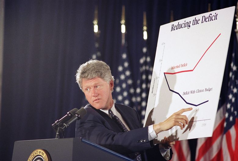
First, note how the chart above starts at 40 thousand deaths from all causes. Restricting the charts range makes the increase in excess deaths look much larger. This is a typical visual distortion used to manipulate an audience. The classic case was president Bill Clinton during a television appearance using a chart slicing off 150 billion dollars from the bottom of the range to leave the false impression that his tax hikes would nearly eliminate the budget deficit by his second term. Note the way Clinton positions his body to mask the fact that chart does not start at zero.
The Washington Post provides readers with the full range in a small rectangle on the right side, but who’s looking at that, or knows what that is, when there is this big orange spike in your face? But that small rectangle is revealing. For those who would appreciate the WaPo for anticipating my objection, the authors produce yet another distortion by squishing the chart in order to justify cutting more than half the range off the numbers. I will follow Stephen Jay Gould in his landmark The Mismeasure of Man in not insisting such distortions are on purpose, but rather that they function to support a narrative the presenter is advancing. I’m being charitable, of course. Putting that small rectangle on the chart really does give the game away.
Second, compare the date of the publication and the date for the final statistic. Why is the last statistic cited weeks before the publication date when later dates were available? Is it because excess deaths start dropping off after April 11 according to the CDC statistics that WaPo is using? (You can find the numbers here: Daily Updates of Totals by Week and State.) As of the date of the publication, the percentage of excess deaths was 103% of expected deaths for this time of year—that is, things had returned to normal. The good news that we are over the hump—and should reopen the country—is thus left out. An important note to make here is that the CDC is showing 25 thousand fewer deaths than John Hopkins is reporting. John Hopkins data is the source the media prefers to use to pump up the death toll. The WaPo was forced to use the CDC numbers because it’s the CDC that reports excess deaths. They’re still reporting the John Hopkins numbers in other articles without acknowledging the 25 percent discrepancy.
Third, the impression the article leaves is that excess deaths not attributed to reported COVID-19, which, as we have seen with states rolling back the death counts after closer examination of the data, is likely too high, should be attributed to COVID-19. The fact that the death counts are likely excessive is concealed by the suggestion that they are instead undercounted. There is no evidence suggesting this. What we know with certainty is that pneumonia cases have been rising and that the pathogens are divided among SARS-CoV-2 and other viral and bacterial infections. In the first week of April we saw considerable excess deaths and this lasted until the first week of May. These deaths are tragic. But the peak was in the first half of April and we have been on the other side of worst part of this pandemic for weeks. The evidence that we were on the downside of the pandemic was rather clear on May 2, especially in light of the fact that those who will die from COVID-19 often linger on life support.
I am sure that some folks will defend the article by noting that the headline does say the “pandemic’s early days.” But that’s beside the point. Why restrict the range of the bulk of deaths from all causes during this period? To make the spike bigger. Why squeeze the chart? To make the spike bigger. Why stop reporting the data beyond April 11? To conceal the drop in deaths after this point. This is propaganda. It’s technical lying.
* * *
Senate Minority Leader Chuck Schumer and Speaker of the House Nancy Pelosi asked Trump to lower flags across the nation to half-staff to commemorate the dead from coronavirus when the death count passes 100 thousand when the news media claims will probably happen this weekend. 100 thousand is an arbitrary figure that Democrats find psychologically satisfying. A big round number. With lots of zeros. Like a million. But it’s not a real number. What Democrats want very much is for Donald Trump to issue the order to that makes him responsible for 100 thousand deaths. They got their wish. Trump has called for flags across the country to be flown at half-staff this weekend in honor of coronavirus victims. He also made the absurd claim that, but for the shutdown he ordered, millions would have died.
* * *
Eighty percent of those dying of the virus are over 65 years old. The CDC reported 68,998 total deaths in the U.S. as of May 16, with 55,651 of those deaths, or 80.6 percent, covering people over 65 years old. Pennsylvania has more COVID deaths over age 100 than under age 45. There are no reported deaths for persons younger than 30 years of age (see Weekly Report for Deaths Attributed to COVID-19, May 17, 2020). This pattern is apparent in state after state. Why did authorities shutter the economy and schools?
* * *
Florida was supposed to be a disaster. Ron DeSantis, governor of Florida, takes the media to task for fantasizing disaster. Check it out:
* * *
Finally a study by Stanford University John Ioannidis “The Infection Fatality Rate of COVID-19 Inferred from Seroprevalence Data” finds that “[e]stimates of infection fatality rates inferred from seroprevalence studies tend to be much lower than original speculations made in the early days of the pandemic.” How much lower? Right in line with the numbers I have been calculating. Ioannidis calculates a fatality rate between 0.2%-0.4%, far lower than the numbers the media reports and closer to the 0.1% death rate of the flu. The death rate is not one or more in a hundred, but two to four in a thousand. “While COVID-19 is a formidable threat,” Ioannidis writes, “the fact that its IFR (infection fatality rate) is much lower than originally feared, is a welcome piece of evidence.” He concludes that “worldwide the IFR of COVID-19 this season may be in the same ballpark as the IFR of influenza.” And thus throwing the world into an economic depression was entirely unjustified.
